One token layer. Four products. Zero visual drift.
Atlas defines semantic color, typography, spacing and elevation as CSS variables so every product in the suite inherits the same behaviour in light and dark mode, while keeping its own accent identity.
Foundations
Semantic color
--background
--foreground
--surface
--primary
--secondary
--muted
--accent
--border
Status
--brand
--success
--warning
--info
--destructive
Scalability
Per-product accents
Foundations
Typography
Ship faster
Display
Marketing hero headlines only, one per page.
- size 48px
- line-height 1.05
- weight 600
- tracking -0.02em
Workspace overview
H1 / Heading 1
Page title, one per screen.
- size 30px
- line-height 1.15
- weight 600
- tracking -0.02em
Billing settings
H2 / Heading 2
Major section headings within a page.
- size 24px
- line-height 1.25
- weight 600
Payment methods
H3 / Heading 3
Card titles and subsections.
- size 20px
- line-height 1.3
- weight 600
Invoice history
H4 / Heading 4
Dense group labels inside cards and tables.
- size 16px
- line-height 1.4
- weight 600
Every product inherits the same token layer.
Body Large
Intro paragraphs and empty-state copy.
- size 18px
- line-height 1.6
- weight 400
Default paragraph text across the suite.
Body
Default for paragraph text and form labels.
- size 16px
- line-height 1.6
- weight 400
Secondary description text.
Body Small
Table cells, descriptions, dense UI.
- size 14px
- line-height 1.5
- weight 400
Updated 3 minutes ago
Caption
Metadata, timestamps and helper text.
- size 12px
- line-height 1.4
- weight 400
Foundations
Overline
Eyebrow labels above section titles.
- size 12px
- line-height 1.4
- weight 500
- tracking 0.1em
Font families
Ag
Space Grotesk
--font-display
Geometric character gives headings a distinct product voice without competing with UI text.
Ag
DM Sans
--font-sans
High legibility at small sizes, ideal for dense data tables and form-heavy screens.
Ag
JetBrains Mono
--font-mono
Unambiguous glyphs for token names, IDs, code snippets and log output.
Responsive behaviour
Headings shrink one step below the sm breakpoint; body sizes stay fixed so line length and reading rhythm remain stable across devices.
Foundations
Elevation & radius
shadow-xs
shadow-sm
elevated
floating
glow
rounded-sm
rounded-md
rounded-lg
rounded-xl
rounded-2xl
rounded-full
Primitives
Components
In production
The system in use
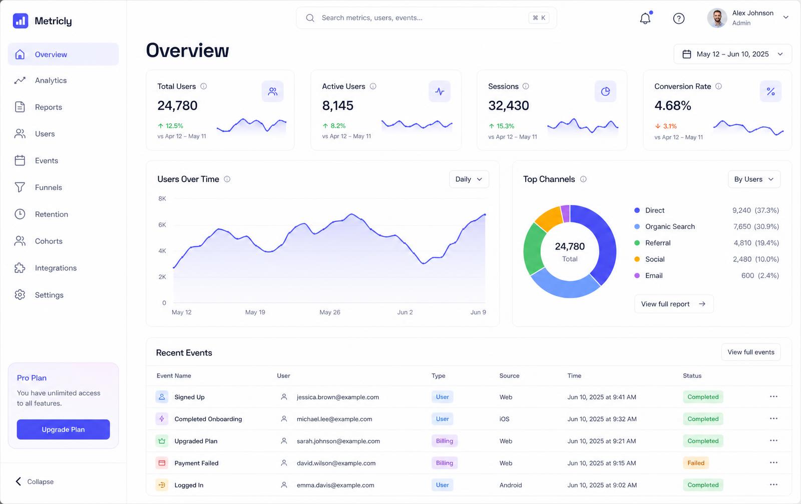
Atlas Analytics — the first product shipped on the system. Every surface, chart color, badge and control below is rendered from shared tokens, with no product-local color values.
Surfaces
bg-background, bg-card and bg-surface for the shell, panels and sidebar.
Accent
--product-analytics tints navigation state and chart series.
Status
Badges map to --success and --warning, never raw greens or ambers.
Elevation
Cards use shadow-elevated; overlays step up to shadow-floating.
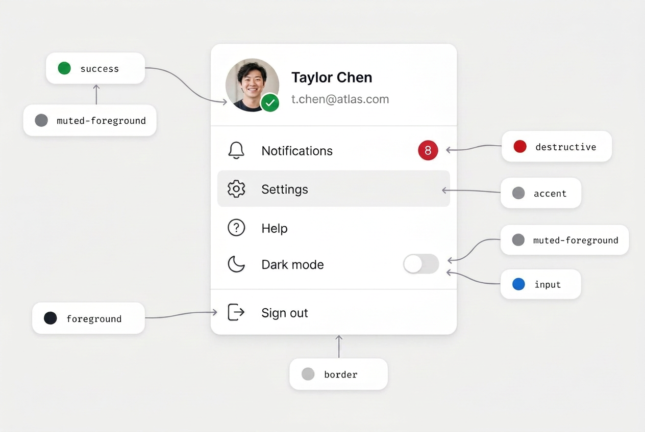
Guidelines
Usage rules
Token first
Never hardcode hex or utility colors. Every surface references a semantic variable.
Accent, not identity
Product accents mark context only — actions stay on the shared brand token.
Both modes always
Every token ships a light and dark value; components are never mode-specific.
Documentation
How to use Atlas tokens
Atlas tokens are CSS custom properties mapped to Tailwind utilities. Reference the semantic variable (e.g. bg-primary) and the value flips automatically between light and dark mode.
Semantic color tokens
// Background and foreground pair
<div className="bg-primary text-primary-foreground p-4 rounded-lg">
  Primary surface
</div>Typography scale
// Display, heading and body styles
<h1 className="text-3xl font-semibold">Heading 1</h1>
<p className="text-base text-muted-foreground">Body text</p>
Heading 1
Body text
Spacing
// Stack and inset spacing utilities
<div className="space-y-4 p-6">
  <div className="h-4 bg-brand-muted rounded" />
  <div className="h-4 bg-brand-muted rounded" />
</div>
Radii
// Radius tokens
<div className="rounded-lg bg-brand-muted p-4">Large radius</div>
<div className="rounded-full bg-brand-muted p-4">Pill radius</div>Elevation
// Shadow tokens
<div className="shadow-elevated bg-card p-4 rounded-lg">Elevated card</div>
<div className="shadow-floating bg-card p-4 rounded-lg">Floating card</div>Documentation
How to use primitives
Primitives in Atlas map to semantic tokens for color, elevation, and typography. Use the variant and state props to keep actions accessible in both modes.
Button variants & states
<Button>Primary</Button>
<Button variant="secondary">Secondary</Button>
<Button variant="outline">Outline</Button>
<Button variant="ghost">Ghost</Button>
<Button variant="destructive">Destructive</Button>
<Button size="sm">Small</Button>
<Button size="lg">Large</Button>
<Button disabled>Disabled</Button>Input states
<Input placeholder="Default input" />
<Input disabled placeholder="Disabled input" />
<Input className="border-destructive focus-visible:ring-destructive" placeholder="Error state" />
Form composition
<Form {...form}>
  <form className="space-y-4">
    <FormField
      control={form.control}
      name="email"
      render={({ field, fieldState }) => (
        <FormItem>
          <FormLabel>Email</FormLabel>
          <FormControl>
            <Input
              className={fieldState.error ? "border-destructive focus-visible:ring-destructive" : ""}
              placeholder="you@company.com"
              {...field}
            />
          </FormControl>
          <FormDescription>Used for billing notifications.</FormDescription>
          <FormMessage />
        </FormItem>
      )}
    />
    <Button type="submit">Save</Button>
  </form>
</Form>